Chart Tutorial
Table of Contents
- Adding a chart to the workspace
- Manipulating charts
- More about charts
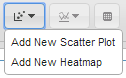
- Epiviz has two types of charts: Plots, that display data by feature, and Tracks, that display data by location. For each of the two, it has a separate menu. Whether you want to add a Plot or a Track, open the corresponding menu, and select the chart you want to add. These menus expand dynamically, as the user adds more chart plugins.
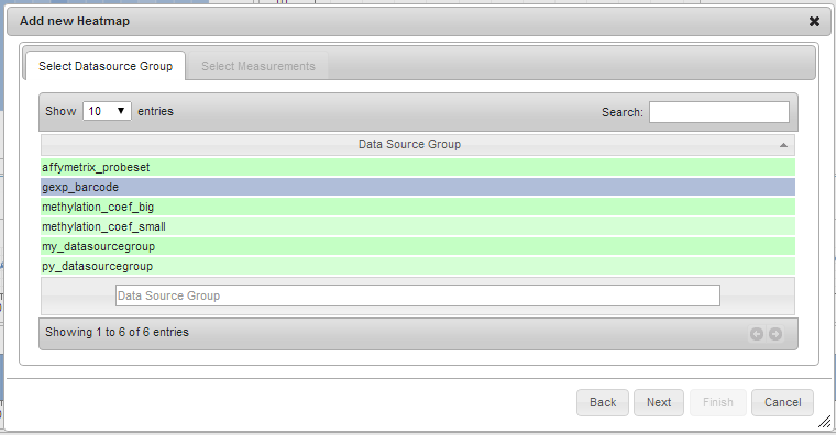
- Select the appropriate data source group from the list. Only one row can be selected. Click Next.
Some charts require measurements to belong to the same data source group, like Scatter Plots. Measurements with
the same data source group have the same genomic ranges associated to each item in the data, and what differentiates
them are their values. For example, all measurements that measure the expression of genes for different tissue types
belong to the same data source group, affymetrix_probeset. The same applies for the Gene Expression Barcode samples, which all belong
to the data source group called gexp_barcode.
-
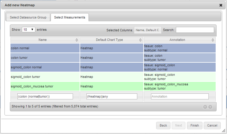
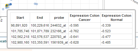
optional Filter the displayed measurements to a subset you’re interested in. In the search boxes you can use regular expressions. For example applying the filter
(colon (normal|tumor))to the name of the measurements in the heatmap measurements dialog will filter to:colon normal,colon tumor,sigmoid_colon normal,sigmoid_colon tumor,sigmoid_colon_mucosa tumor. -
Select the measurements you want to use for the newly created chart. You can use the
ShiftorCtrl(Mac:Command) keys to select multiple measurements. Click Finish.
Some charts require a minimum number of measurements selected. For example, the Scatter Plot requires two. The order
in which you select the measurements is also important! For example, the Scatter Plot will display the first selected
measurement on the X axis and the second on Y.
- The new chart is displayed on the screen.
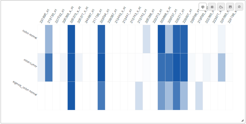
The charts in {{ site.epiviz }} are all resizable, and all feature a number of options, some specific to the chart, some general. In this section we go over a few of them.
- Toggle Tooltip. This button allows the user to toggle between showing and hiding tooltips on chart object hover.

- Colors. In {{ site.epiviz }}, colors in all charts can be customized.
- Take, for example, a line track with two measurements:
Methylation Colon Cancer, andMethylation Colon Normal. Initially, the first measurement is colored blue, and the second, red.
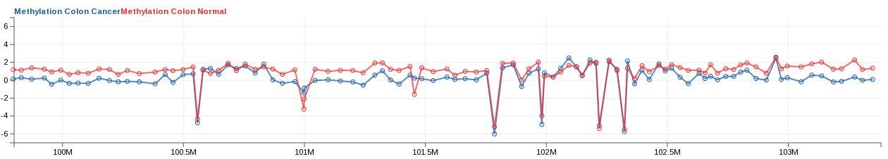
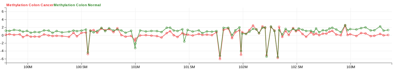
- In this case, the default chosen colors are counter-intuitive, so we choose to change
Methylation Colon Cancertored, andMethylation Colon Normaltogreen. Open the Colors dialog, and select the first color, assigned toMethylation Colon Cancer; pick a shade of red for it. Then select the second color, assigned to the second measurement; pick green. Click Ok.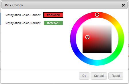
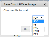
- Save Chart. All charts in {{ site.epiviz }} are represented as SVG, and can be saved to the local computer in various file formats: PDF, PS, PNG, SVG, and EPS. Click the Save button; in the dialog, choose the desired file format, and click Ok.

- Custom Settings. Charts in {{ site.epiviz }} also have settings specific to the visualization type, allowing to customize how many objects are displayed at a time, their size, axis boundaries, margins. Each chart has a Custom settings button that opens the options for that particular chart type.