Differential Analysis with MetagenomeSeq and Metaviz
Metaviz is a tool for interactive visualization and exploration of metagenomic sequencing data. It provides a novel navigation tool for exploring hierarchical feature data that is coupled with multiple data visualizations including heatmaps, stacked bar charts, and scatter plots. The metavizr package implements two-way communication between the R/Bioconductor computational genomics environment and Metaviz. Objects in an R/Bioconductor session can be visualized and explored using the Metaviz navigation tool and plots. In this post we show how to use metavizr and the metagenomeSeq Bioconductor package to perform a statistical and visual analysis of differential abundance of metagenomic data.
First, the following libraries will need to be downloaded and loaded:
library(metagenomeSeq)
library(msd16s)
library(metavizr)
Generating metagenomeSeq objects and computing differential abundance
In an R session we will use metagenomeSeq to compute differential abundance. We focus on the msd16s dataset and its 301 samples from Bangladesh.
In metagenomeSeq, we first subset the data to only Bangladesh samples, aggregate the count data to the species level, and normalize the count data.
aggregated_feature_order <- colnames(fData(msd16s))[3:9]

msd16s_species <- msd16s
fData(msd16s) <- fData(msd16s)[feature_order]
fData(msd16s_species) <- fData(msd16s_species)[aggregated_feature_order]

bangladesh <- msd16s[, which(pData(msd16s)$Country == "Bangladesh")]
bangladesh_species <- msd16s_species[, which(pData(msd16s_species)$Country == "Bangladesh")]

aggregated_species <-  cumNorm(aggregateByTaxonomy(bangladesh_species, lvl="species"), p = 0.75)
We then aggregate another copy of the Bangladesh subset to aggregate to the “class” level, normalize count data, and compute differential abundance at the “class” level between dysentery cases and controls.
aggregation_level <- "class"
aggregated_bangladesh <- aggregateByTaxonomy(bangladesh, lvl=aggregation_level)

normed_bangladesh <-  cumNorm(aggregated_bangladesh, p = 0.75)
bangladesh_sample_data <-  pData(normed_bangladesh)
mod <-  model.matrix(~1+Dysentery, data = bangladesh_sample_data)
results_bangladesh <-  fitFeatureModel(normed_bangladesh, mod) # Check: ?results_bangladesh
We can then extract a list of bacterial classes that have a log fold-change greater than 2 and an FDR adjusted p-value less than .1 between dysentery case and control samples from Bangladesh. Once we have this list of differentially abundant classes, we propagate them to an MRexperiment at “species” level to visualize and explore these results. The differential abundance cutoff can be set to a different threshold and the aggregation level can also be changed to examine the dataset.
logFC_bangladesh <- MRcoefs(results_bangladesh, number = nrow(normed_bangladesh))

feature_names <- rownames(logFC_bangladesh[which(logFC_bangladesh[which(abs(logFC_bangladesh$logFC) > 1),]$adjPvalues < .1),])
fSelection <- generateSelection(feature_names = feature_names , aggregation_level = aggregation_level, selection_type =2)
Creating metavizR object
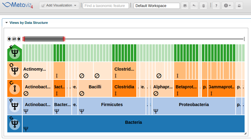
The next step will be to launch a Metaviz instance from the R session, add a ‘FacetZoom’ object, modify the node selections to show those nodes that are differentially abundant, and add a heatmap showing only species within differentially abundant classes. Load the ‘metavizr’ package and create a Metaviz instance by calling
app <- startMetaviz()
This will open a new Metaviz session on the default browser.
Then, to add a FacetZoom object of the msd16s hierarchy the following call is made to create a Metaviz control object then add a plot.
control <- metavizr::metavizControl(featureSelection = fSelection)
icicle_plot <- app$plot(aggregated_species, datasource_name="msd16s", control=control, feature_order = aggregated_feature_order)
The ‘plot’ function adds the object to the Metaviz session.
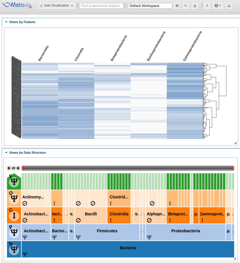
Adding heatmap
This step is simple using metavizr, all that needs to be done is call the ‘revisualize’ method to add another visualization of the same data.
heatmap <- app$chart_mgr$revisualize(chart_type = "HeatmapPlot", chart = icicle_plot)
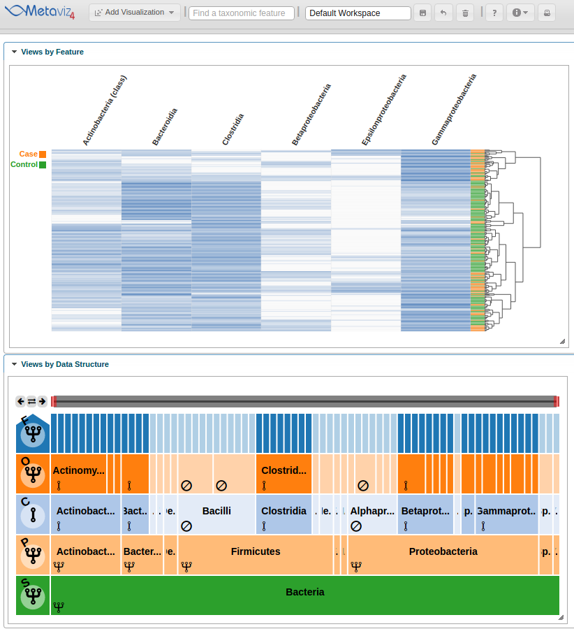
Now a heatmap is added to the Metaviz workspace.
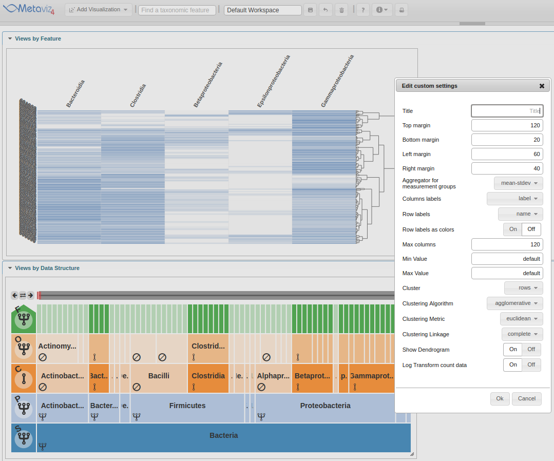
Modifying Settings and Exploring with the FacetZoom object
Now we modify chart settings to customize the visualization for our purposes. We group-by Dysentery and modify the color settings. To accomplish this we click on the ‘Custom settings’ icon.
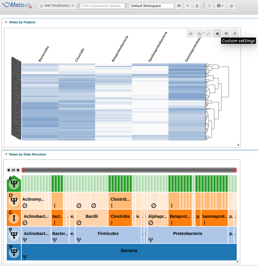
This launches a pop-up dialog window with all available chart settings.
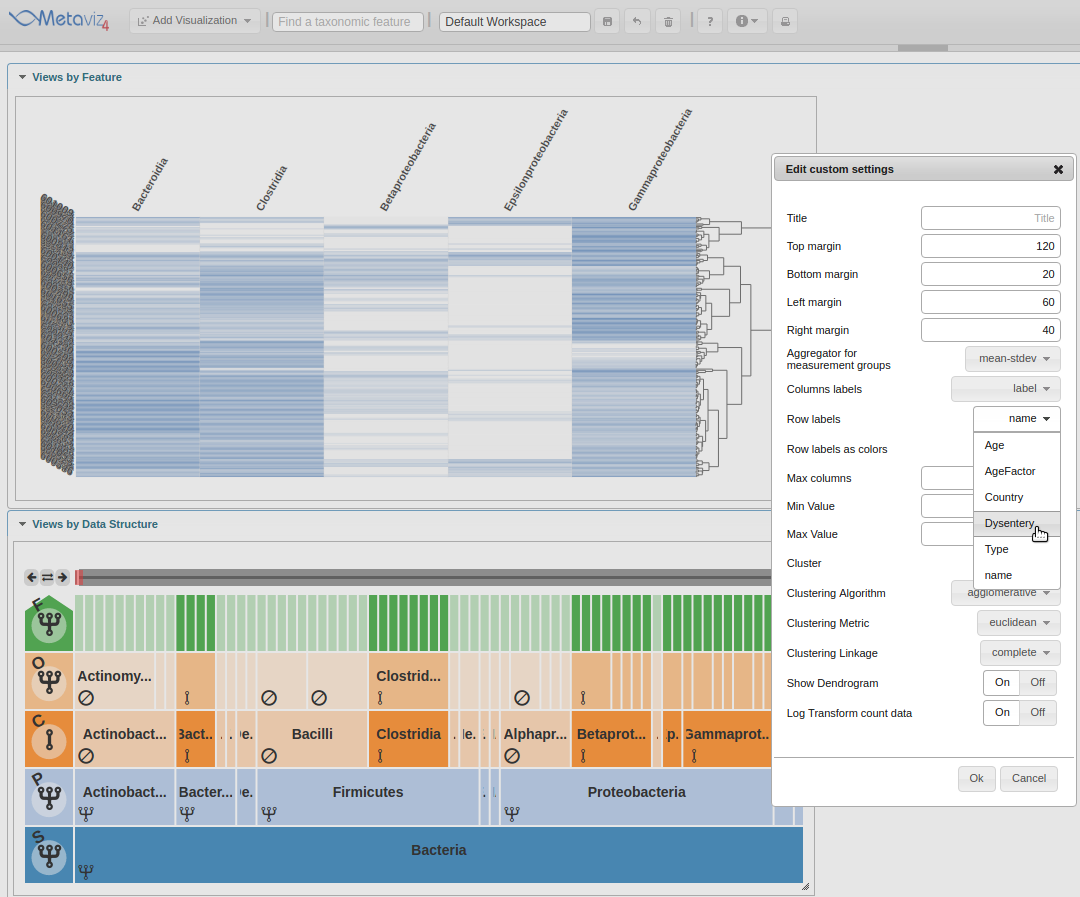
The first setting to change is the ‘Row labels’ which will be set to ‘Dysentery’.
Next, move the ‘Row labels as colors’ radio control to ‘On’.
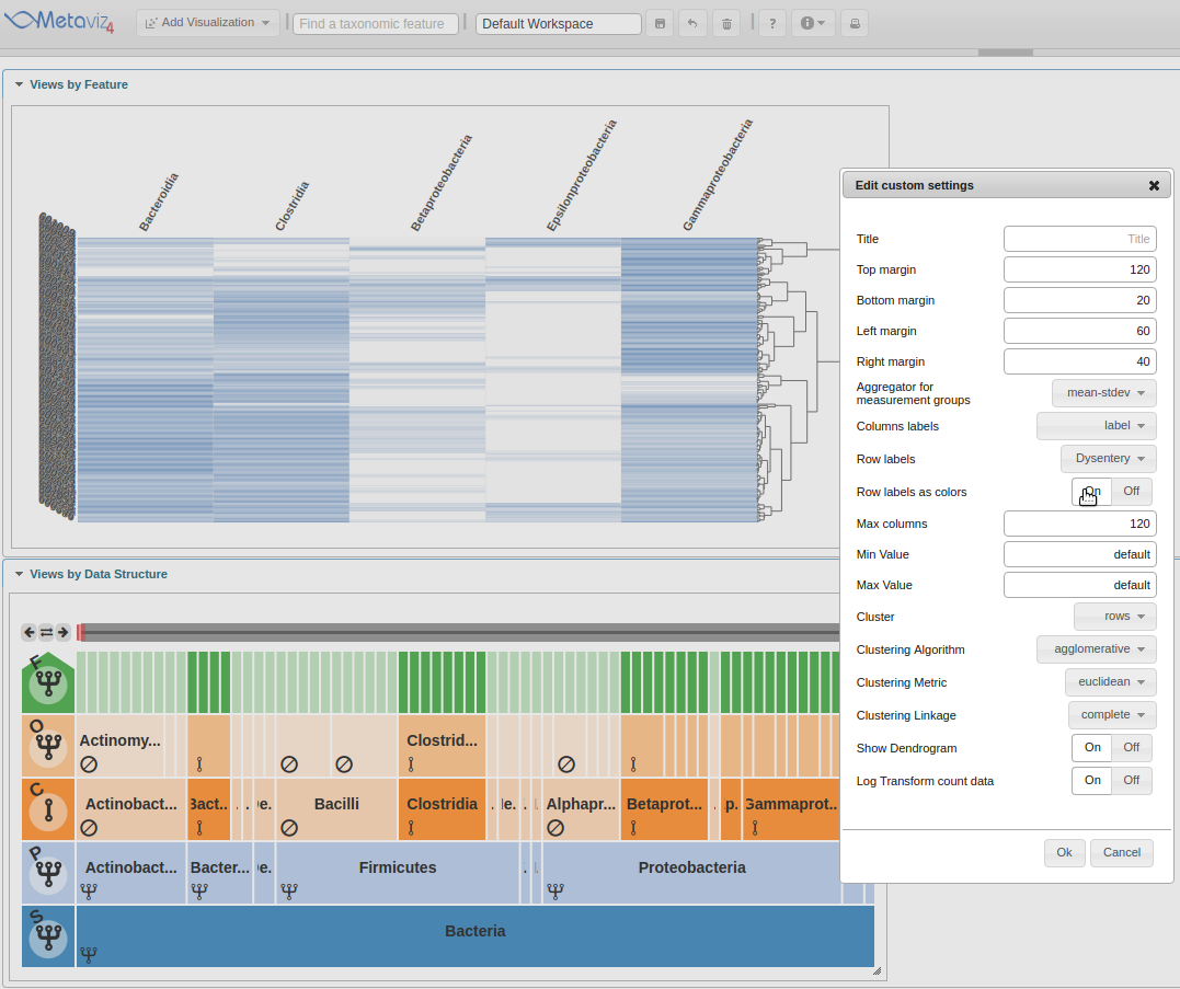
Now the heatmap rows will colored by the ‘Dysentery’ status.
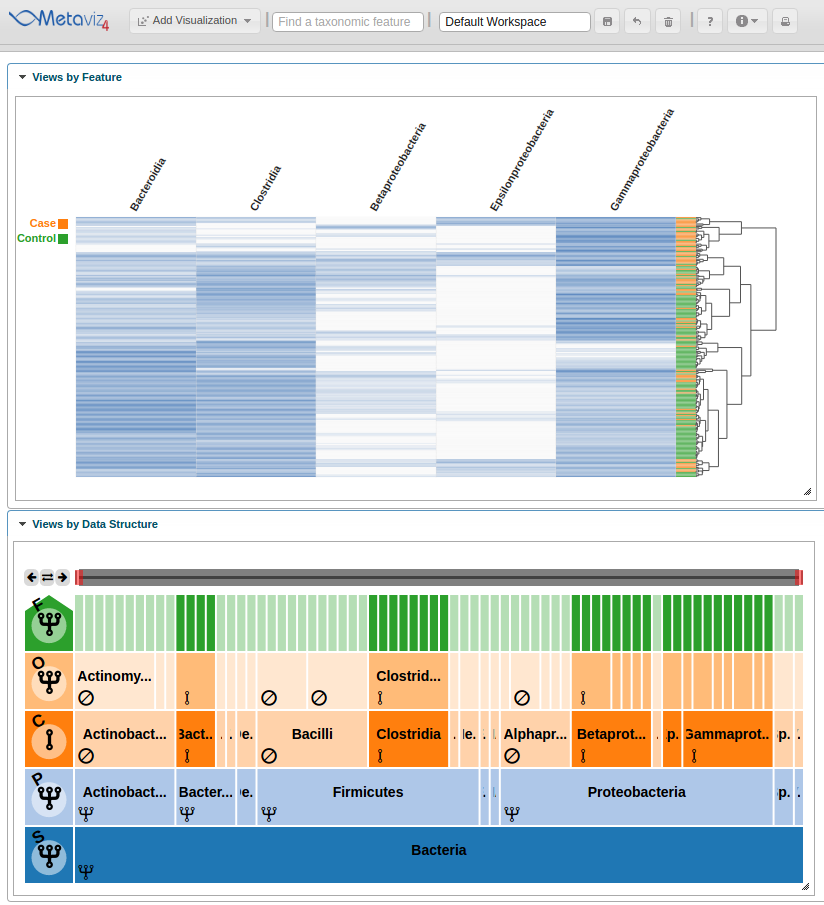
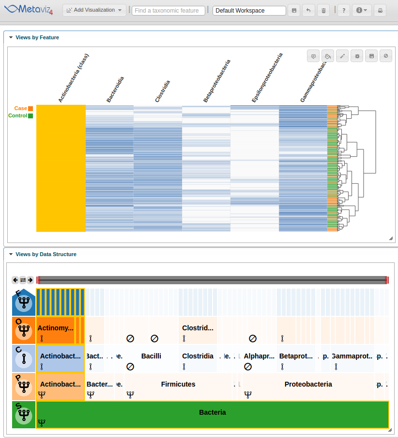
As with a FacetZoom control added from the UI, a user can modify node states in order to examine the statistical test result. We modify the navigation widget by changing the ‘Actinobacteria’ status from removed to aggregated.
We can then hover on the new column of the heatmap to highlight the path through the hierarchy.
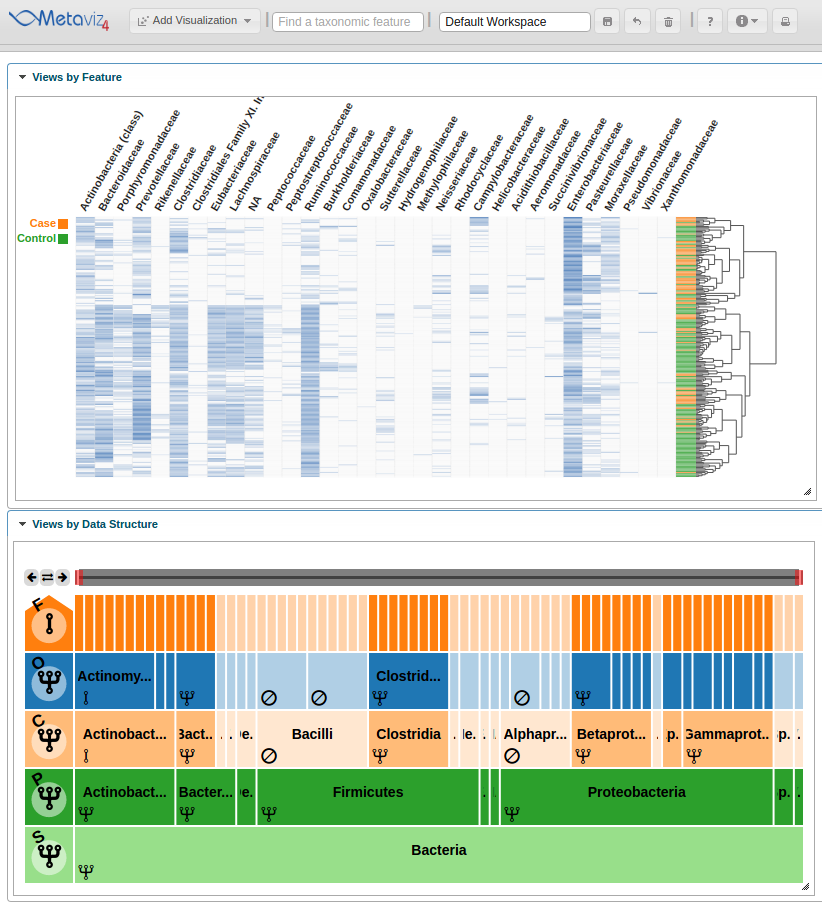
A user can also traverse the hierarchy and change the aggregation setting for all nodes at a given level. To show this utility, we navigate to a lower level of the hierarchy by clicking on the ‘Proteobacteria’ node and set the aggregation level to ‘Family’ by clicking on the row control node.
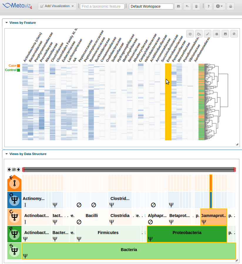
Then we can hover on a column that appears to show a difference between case and control samples.
We also can modify chart settings directly through metavizR. The code block below shows how to list the chart settings, update the ‘Row Labels’ and ‘Color-By’ settings, and propogate those changes to the Metaviz interactive visualization.
# List available chart settings
app$chart_mgr$list_chart_type_settings("HeatmapPlot")

# Choose new settings
settings <- list(rowLabel = 'Dysentery', showColorsForRowLabels = TRUE)

# Apply settings to existing chart
app$chart_mgr$set_chart_settings(heatmap, settings=settings)