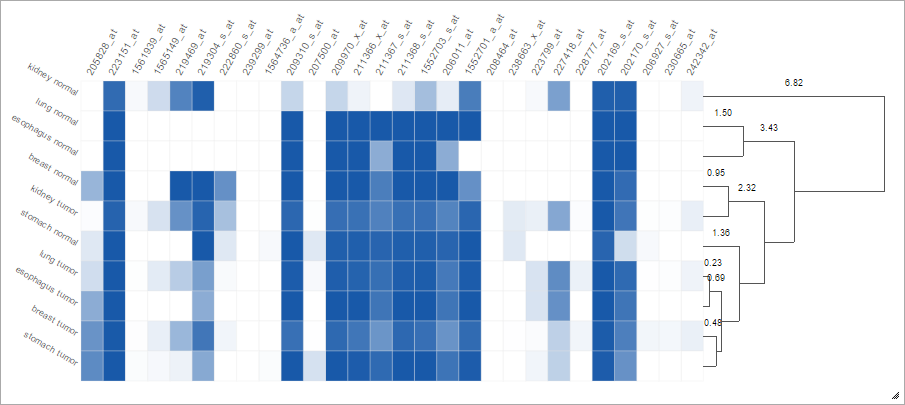
We implemented a new Clustering feature in the Heatmap Plot! You can use it to group together measurements using the values in the selected region.
For example, we selected the following samples in the gene expression barcode: kidney normal and tumor,
lung normal and tumor, esophagus normal and tumor, breast normal and tumor,
stomach normal and tumor.
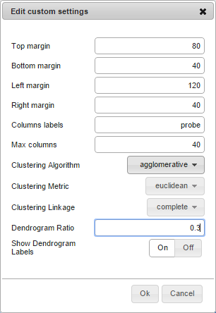
In the custom settings menu of the newly generated chart, we enabled clustering:
This causes the rows to be re-ordered according to the clustering, and a dendrogram to be displayed: